


OUR GUIDE TO...DECORATING WITH NEUTRALS
24 October, 2019
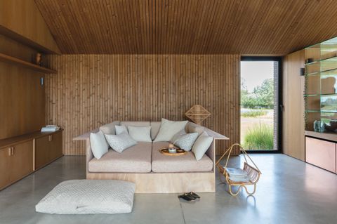
You may think a neutral scheme can be a bit on the safe side, or even – dare we say it – boring? But with the right thought and care, neutral paints and furnishings can create a space with real warmth and interest.
When a neutral room really works, it looks absolutely effortless. The problem is, it's harder than you might think to get this right. The secret is to use a variety of neutral shades and to add layers of texture to create both visual and tactile interest.
In our latest blog post, we guide you through how to use neutrals to create a scheme guaranteed to look warm and inviting rather than cold and soulless.
CHOOSE YOUR TONE
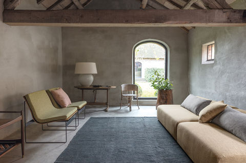
Neutral schemes work best by layering a variety of calming shades. But it's important to first decide on a palette that is made up of either warm or cool tones. Choose one and then stick to it.
Colours with cool undertones contain pink, violet or blue pigments, and those with warm tones have a hint of green or yellow to them. Cool tones work best in south-facing rooms because they help to balance the intensity of the light. While warmer tones work brilliantly in north-facing spaces to create a cosy atmosphere in a room which might otherwise feel dark and cold.
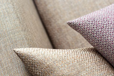
BE BRAVE WITH TEXTURE
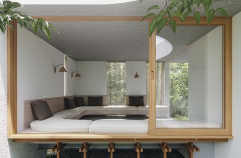
It might sound contradictory to be brave when decorating a neutral space, but when it comes to texture it's important to be bold. Texture is the key element which will bring your neutral scheme to life. Creating contrasting textural layers helps to bring the overall design together while adding warmth, depth and character.
On-trend materials such as faux fur, leather and bronze can be combined to create real impact and a truly individual look. Choose chunky throws and rugs, and add extra textural interest with contrasting materials such as sheepskin, linen and seagrass.
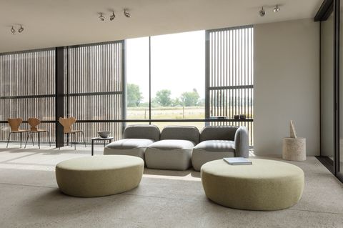
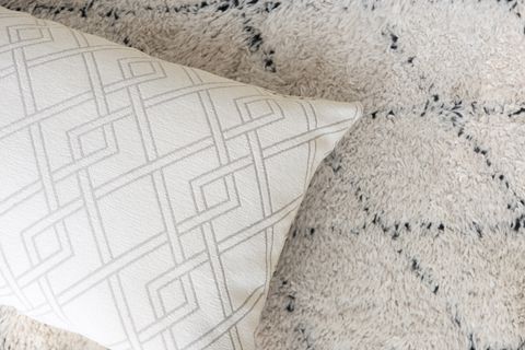
VARY YOUR NEUTRALS
With so many modern neutrals to choose from, beige doesn't have to be boring. In fact, neutrals are no longer limited to beige, cream and white. The term 'neutral' can now apply to a wide range of colours in subtle tones inspired by nature.
In order to achieve real depth and contrast in your interior scheme, it's important to vary the kind of neutrals you use. Use of sliding scale of neutrals going from very pale to dark – while remaining on the same spectrum in terms of 'cool' or 'warm' tones. Pale neutrals could include blush pink, muted lilac or watery aqua as well as the more obvious off-whites, creams and greys. Medium neutrals cover colours such as taupe, stone and mushroom. And dark neutrals include more dramatic hues like chocolate brown, charcoal and terracotta.